Thursday, May 18, 2017
End Of Module Evaluation
All in all, i think this was a nice way to wrap up the year, i found both briefs engaging and enjoyable and its been a long time since ive been able to say that. The analogue side of studio brief one and the taking ownership of studio brief 2 are what made me enjoy them so much i think. other than that i dont think i have much to say, there's nothing about the way that the module was delivered or set out that i would change and im quite happy with how i worked. I managed to complete the aims i set out for myself and i created a body of work that im proud of. Due to my struggle to concentrate, time management is always an issue for me but i feel like i worked well within the module and lessened my own work load by getting things completed sooner rather than later.
Product, Range and Distribution - Evaluation
I really really enjoyed doing this brief as i got lost in hours and hours of information about a really current issue and found myself being more educated on a number of different topics, this has allowed me to be more present in the conversation of politics with my friends and through design. With my final resolutions i think i effectively communicated my two aims although it took a long time to get there. As set out initially i need to work on cutting down my work to the key information that is needed rather than falling deeper and deeper down in to the research hole i so often found myself in. I really like the outcome of this brief too, it is something i can see myself looking at and reading if i was looking at them and it is something i actually hope to upload to social media and use for its intended purpose.
as always, with more time i would loved the opportunity to do more and produce the incredibly in depth publication i initially wanted to make so that i could talk all about polls, bias in the media pros and cons of FPTP voting system and all about tactical voting and all the other things i found myself learning about. I also really wanted to utilise my skills in after effects to make a video to promote fact checking but i just didn't have time by the time i had thought about doing it. As an after thought im hoping these posters make people feel encouraged to vote and not like their being told to do something like the kind of vibe you'd get with a dont do drugs ad.
All in all im extremely pleased with the outcome
Product, Range and Distribution - Production
I ended up with two posters, one reminding people to register and one reminding people to vote. I made to high impact posters with very simple graphical elements. I wanted a huge emphasis on the date of registration closing and the general election, i put this down the side of the page as big as i could make it and i made it coloured to contrast against the striped grey background. The reason i chose a striped background as the lines are high impact and subtly lead the eye to the date at the side of the page with out distracting from the main message. I used a large sans serif font in order to increase legibility and make its accessible to as many people as possible as well as just being legible from afar.
when deciding on colours i initially chose red and blue but then i realised that corresponds to two political parties, taking that into consideration that then ruled out using red blue green orange and yellow as i wanted to remain non biased. I settled on a bright pink as it is quite a youthful colour and thats the audience im hoping to appeal to and also its is an attention seeking colour and it will hopefully draw your eye to the poster.
From this i then developed my information posters. The design was largely the same except i added icons in order to increase the accessibilty of the poster. This breaks up the information on the page but it also gives an image to tie the information too, hopefully making the information more memorable. I kept the icons simple for all the above reasons. Simple, quick and effective communication.

Product, Range and Distribution - Idea Development
When it came to making, i started to make a list of what i wanted to make and it was getting very long very quickly and i was getting lost in my hole of research again, half way through researching voting theory, different voting methods employed by the uk and alternatives and pros and cons of the first past the post method i decided that i really needed to narrow down my idea.
The election is time sensitive, people are running out of time to learn about tactical voting and its effect on exit polls so i decided to go back to my initial aims - get people to vote and get them to research.
As you have to register to vote i decided to add that in to the mix as an alarming amount of people i know are putting it off for no reason. I had my 3 final outcomes - register to vote, how/where to vote, and research.
I wanted the designs to be simple and high impact, a focus being on dates of the general election and the information i was providing.
I wanted to use statement that would stand out and be remembered: Dont Forget, Have your Say and Check the facts.
they were the only changes made to my initial design ideas.
Product, Range and Distribution - Critique
For this critique i had two questions:
Shall I make it digital or physical?
shall i include information that is party specific or is that too risky?
Presenting my initial ideas, my feedback was encouraging, everyone could see where i was coming from and what i was aiming to do with the project meaning that my contextual research has been successful.
The first question wasn't really answered but from the discussion i concluded that it would probably be best to focus on making it digital. The election is a time sensitive issue and so time is definitely a consideration, by the time I could get a publication properly printed there's a chance the election will be over.
In terms of adding party specific information that was a definite no. it is too risky and especially on social media it will just invite people to argue which is not the intention at all.
When talking through my ideas people seemed to resonate with the whole idea of fact checking so that is something i would definitely like to emphasise.
Product, Range and Distribution - Idea Generation/More research
My initial idea is to create a booklet on how to fact check and lots of other information regarding voting such as how to vote, where to research, what news papers support what parties, what is tactical voting and how does it work, how does the vote work in the Uk
This lead me to more research about the voting system in the UK, i needed to be familiar with this myself before writing about it.
My two main aims were to encourage people to vote and to encourage people to research before voting.
I wanted to create a voting guide
target audience would be students and young people who are eligible to vote. This is because we are the most influential group of voters.
The reason i want to create a voting guide as it is something that is very current, relevant and something i feel is really important.
Resolution i hope to be a digital and or physical publication.
Some topics i want to focus on are; Newspapers as a source of information
Websites as a source of information
Fact checking
Voting.
Design considerations;
Simple, legible not fussy. I want it to be accessible to everyone and i dont want complicated design to obstruct how effectively the information is communicated.
Simple shapes and simple design, again i want this to be accessible to all kinds of people including those with dyslexia. I looked up how to make the type dyslexia friendly and so far its only been shown that its easier to read sans serif typefaces so i will take this into consideration.
I want to use bright colours in order to avoid it looking to formal or corporate.
Tone of voice: I want it to be formal in the sense that i will endeavour to make all the information correct, accurate, up to date and non biased but informal in the sense that i want it to be an easy read and not full of complicated political jargon.
Distribution: the reason i want it to be digitial as it will allow it to be easily distributed through social media. As the idea is to combat the incorrect nonsense on social media, it will be in the perfect place to remind people to check the truth. Also as i want to encourage people to vote, social media is the easiest way to pass it on quickly and get it viewed by lots of people.
Product, Range and Distribution - Refined Research
When i started this project, there was no general election, this is really lucky i guess because it gives me a specific area to focus on and will allow me to hone in my research.
Only 72% of people voted in the general election, which means 12,949,258 people didnt vote. This is an incredible amount of people and more than enough to swing the majority either way.
Whether people vote is effected by stupid things such as the weather, laziness or simply not knowing whats going on.
Left wing, right wing and centrist meanings and news papers aligned with each one. Centrist newspapers are probably the best source of information when it comes to politics as they arent aligned either way, they tend to be concerned with policies from either party which will inflict large social change.
It's amazing how much wrong information is perpetuated by the media, it is important if not vital to call politicians on their shit and do your own research. There are great independent websites that are dedicated to delivering non partisan, factual information wherever possible such as FullFact.com.
Immigration is perhaps the subject that is most misconstrued in the media. It seems that the general public have no idea how people enter the country, how their benefits are distributed and how many immigrants we actually have.
Usign fullfact.com and a report conducted by london school of economics it was shown that only 5% of the uk population are immigrants.
in the 12 months before September 2016268,000 citizens came from the EU and 103,000 emigrated meaning net migration is 165,000 (which is tiny)
The report also showed that of those immigrants who are of working age, 80% of them are employed, compared to 75% of uk natives
They are also better educated, 62% of eu immigrants had a degree, compared to 24% of the comparable percentage of uk natives. EU immigrants earn more in taxes than they receive in benefits and this only served to benefit the uk as it relieves the FISCAL burden on uk nationals and their taxes go to funding the public sector. They are also less likely to live in social housing, and less likely to receive state benefits.
The amount of child benefits immigrants receive is often over estimated by up to 200%.
So many claims were made about EU influence of uk law and legislation but upon researching that it turns out that no one really knows how much influence the EU has into uk law and legislation, its too difficult to figure out as law and legislation is so complicated.
All of this allowed my to narrow down my research again and finally settle on the topic of my practical work;
People are checking the truth, and people aren't voting.
I want to make something that encourages people to vote and people to fact check.
Product, Range and Distribution - Study Task 2 - Appropriation and Subversion

What i got from the session was that everything is up to interpretation and manipulation. We should always question who what why and when when it comes to art because the industry is such where plagiarism, alternate interpretation and manipulation is rife. This is particularly relevant to my subject choice as it to just reinforces the idea that you need to check you facts and your sources to make sure you're consuming correct information.
This task was quite useful as it introduced me to one method of working within my topic choice and it gave me more context and more information regarding manipulation and misinformation.
Wednesday, May 17, 2017
Product, Range and Distribution - Study Task 1 - Presentation/Research
My research for this brief started with the presentation task.
"identify an issue and gather a body of research on this topic. The issue can be anything you wish but you should consider this carefully so that it provides enough opportunity for research and critical awareness in the areas of politics, ethics, society and/or technology."
"identify an issue and gather a body of research on this topic. The issue can be anything you wish but you should consider this carefully so that it provides enough opportunity for research and critical awareness in the areas of politics, ethics, society and/or technology."
I decided for this brief to tackle the sensitive subject of politics. I decided on Brexit as my starting point for this as it was very relevant and recent and most people have at least a basic knowledge of what was going on.
Very quick in to my research i realised that there are so many conflicting opinions and facts, I found it difficult to find reliable sources of information as it was all so biased based on what side they had taken. This ultimately lead me to the Topic of my presentation.
I decided to tackle this whole issue by taking the opportunity to clear up some misconceptions about Brexit and at the same time illustrate the problems surrounding bias and straight up lying when it comes to politics.
I looked at news papers to get the main topics of my presentation as i wanted to focus on the most common misconceptions.
I then looked at a site called FullFact which is an independent fact checking website, meaning that all information is accurate and most importantly non biased. They have no over arching goal other than to produce the facts and truth about claims regarding a wide range of issues.
With the topic of politics i found myself in a deep deep hole of information and anger and this lead to my presentation being almost 15 minutes long rather than 5. It took a lot to edit it down as i felt that there was so much to be said and i ended up having 7 pages of notes., but i think that will give me another aim for this brief;
- work on selecting the most relevant research and content.
As my audience were young people i wanted the presentation to be quite light hearted so that I didn't lose their attention. Throughout my research i was able to find some quite funny things regarding EU law and legislation which allowed me to make the presentation humorous.
Product, Range and Distribution - The Brief
This brief is in two parts -
Part 1: Based on the introductory sessions develop a practical, visual and contextual investigation of a specific subject (an issue). You should aim to develop research from a range of primary and secondary sources in order to fully explore the opportunities for informed creative development. Your research and development of this part of the brief should be documented on your Studio Practice blog and will be presented as part of your interim concept pitch.
Part 2: Devise and develop a body of practical work that both distils your knowledge of an identified issue and demonstrates your ability to tap into the market potential for socially, politically and ethically-driven design. This output should still work within the broader creative and professional contexts of graphic design but could be based around ideas of awareness or protest.
Looking at this brief carefully i have set out some personal aims for this brief:
- Spend time gathering in depth research
- Accurately represent that research through my practical response.
Leeds Public Spaces - Evaluation
I quite enjoyed this brief as it gave me the chance to look into the history of the city i live in. Despite living here i haven't always lived here which means there is still a lot that i dont know about Leeds and this was a really nice chance to get to know it a bit more. I always enjoy the tradition print briefs as it gives me an excuse to get away from the computer and away from the studio and exercise and develop my analogue skills. Every time i do screen printing, i learn something new and i get a little bit better which i find extremely beneficial for my practice and love the opportunity to screen print.
I'm sad that i rushed the actual printing process as i ended up misprinting. The good thing about this is i think i'm the only one who will know, but its still a little bit disappointing after all the hard working planning and preparing to print. The good thing is that it doesn't effect the overall print at all, its just a personal disappointment.
If i were to do anything differently, like always, i would like more time to execute the whole thing, I may have eventually been able to find a way to get all my initial imagery to work together and i probably wouldn't have printed the face the wrong way around.
Leeds Public Spaces - Final Outcomes
I did a three colour screen print, in red white and blue to represent the colours of the UK. Using the white allowed my to implement the feedback i had received. I printed the most busy pattern in a thick white so that you were able to see it at a standard distance from the print but it didn't overpower the whole design. I had gotten the dates mixed up for the submission and rushed my print a little bit, i ended up printing the face back to front. I think i'm the only one who knows that its the wrong way wrong so it doesn't effect the end result at all.
Leeds Public Spaces- Feedback
Despite simplifying my design i was still struggling with placement, i talked to Simon about my design to get some feedback and i was worried that the pattern of the crystalline structure was too busy for the print but i felt like it was a vital part of the design. He suggested that i still use the pattern but play around with the colour and opacity in order to reduce how much of a visual impact it had and allow it to flow with the rest of the design. This really helped me resolve a big issue surrounding my design and i was able to progress to the final outcome.
Leeds Public Spaces - Production
I isolated different parts of the images and used a light box to try and arrange them. I was finding it incredibly difficult to bring all these elements together in a cohesive way. Individually the images are really nice but i think they're so busy that they're just clashing with each other.
I tried lots and lots of iterations of my design, moving and placing things together in different ways but i just couldn't get it to work. I realised that i was going to have to remove some elements in order to get it to work.
Despite it being one of my Favorite parts i decided to remove the design by Victor Pasmore as i cant find any direct evidence that his designs were featured in the exhibition that happened in Leeds. I decided to take away the images of the town hall and museum, although the blitz is war related and rebuilding these was part of post war recovery, it wasn't directly linked to the festival of Britain. This simplified my design right down and there were only a few elements on the page making it really nice, open and free.
Because i now had so much open space, i decided to add some text, having fewer elements on the page made the design quite ambiguous and i felt like adding some text would be good in order to identify what it was about. Using the book i borrowed i was able to see some of the type used in the exhibition, because it wasn't named i had to find the typeface that most resembled it.
Leeds Public Spaces - Idea Development
When looking through the images, im finding that parts of the exhibition design are really cool and quite modern for the time and its something i really wanted to look into. I took out a book from the library on the festival of Britain to try and see if i could find any of the designers names or the people who designed the exhibition but the Festival of Britain was so large and the exhibition in Leeds was just as small part of that so it was really difficult to find the individual designers who worked on that specific exhibition.
I wanted to represent how far Britain has come since then and celebrate Britains ability ti recover so i picked out some images that i felt represent that.
the first two are buildings that were destroyed during the blitz, the town hall and the museum.
Secondly, i found an image that was on the wall of the exhibition. To me it represents the progression and talent of British artists but also the knowledge that we have;
http://leeds.festivalofbritain.woodhousemoor.com/800-2/
Through my research i found one artist, Victor Pasmore, who made really nice interesting patterns that i think visually will be really nice and work well on the print.
http://www.ayrshirearts.com/Spaces/Gallery/Images/Victor%20Pasmore.jpg
the last image is inspired by the festival pattern group. These patterns were based on crystalline structures that were discovered through x-ray imaging in Leeds.
http://leeds.festivalofbritain.woodhousemoor.com/800-2/?afg1_page_id=4#afg-1
Leeds Public Spaces - Ideas
After looking through a website online that documented the visit of The Festival of Britain to Leeds, i find that the exhibition had quite a lot of really cool visuals. It reminded me of people years ago trying to predict what people in the future were going to be wearing or what kind of inventions we were going to have. My initial idea is to look closely at the images and try pick out some elements that represent and highlight some key areas that we have progressed in. There are lots of strong visual images throughout including lots of fabric prints that are really interesting.
My initial idea is to bring together some of this imagery into one screen print. The reason i would like to do a screen print is i feel like its the most effective way of bringing images together in a traditional print method.
To begin with im going to sort through the images and find visuals that i really like.
Leeds Public Spaces - Crit 1
We had a crit really on into this project and i think this was really beneficial to me because talking about really loose ideas gave me the oppertunity to see which ones people would be interest in and help guide my direction.
At this point I have narrowed down my options to;
The festival of Britain
Love Parade
Leeds West Indian Carnival
During my crit i talked about why i had chosen each one.
The festival of britain;
This was a travelling exhibition that went across the whole of the uk after the second world war to promote post war recovery and Britain contributions to all kinds of industries. The reason i chose this is that in some way it feel quite relevant. After brexit a lot of people are feeling quite bleak and its a chance to remind people that despite everything the UK is a great country that produces amazing
things.
Love Parade:
Love parade was a large music festival that was only held in the UK when it visited Leeds in 2000's Due to the music and festival aesthetic i feel like this could be a good way to go visually.
Leeds west Indian carnival:
This the longest running west Indian carnival and its coming up to its 50th anniversary. Due to the nature of this carnival i think it would be really interesting colour and design wise and have a lot of history to draw upon.
I talked about my ideas and my crit group was very interested in the festival of Britain because it was something that no one had heard of and for the fact that it does seem quite relevant to the current events. As it was an exhibition and it was quite well documented, there would be a lot of visuals and history to draw upon and would fit the celebratory nature of the brief. I was quite glad that the crit went this way because i realised that i was leaning quite heavily to that idea anyway.
Leeds Public Spaces - Research
For this brief i started by researching events that have happened in Leeds over the years focusing in on public places I have already identified;
Leeds Trinity
Corn Exchange
Millennium Square
Call Lane
Hyde Park
Burley Park
O2 Academy
First Direct Arena
The public streets of Leeds.
The first thing i realised is that so much has happened in Leeds that i and probably many other people, didn't even know about. Because so much has happened i narrowed it down into events that interested me personally and would like to learn more about.
These events were;
Exhibitons and protests
Parades (eg Pride)
Leeds Children Day
Longest running West Indian carnival in Europe
The Blitz in Beeston
Festival Of Britain
Love Parade.
Now that I have narrowed it down I plan to think and look at each of these in slightly more detail in order to decide which one i would like to focus on.
Monday, April 3, 2017
Collaborative Practice Outcomes and Evaluation.
After the fourth week in the group, my role became very organisational. I made sure that each week we all knew what it was we were doing, that we had roles that suited our skill set and that the work load was equal and fair. Then at the end of each session i made sure we all know what to have for the next session and when to meet up.

The different colours mark out different elements for the layout.


Towards the end, i had more of a practical role as we were all chipping in to get thing finished. I was using my knowledge as a graphic designer to help lay out the poster using a grid system and I translated the ideas the two other members had about typefaces into actual fonts, taking the elements the wanted and finding typefaces that matched what they wanted. as part of the packing consideration i though it would be nice to reinforce our theme through the brand. I did this by putting a little snorkel on the Bear mascot, however in the end it didn't get used.

The different colours mark out different elements for the layout.


Our final outcome:

Overall i'm really pleased with the outcome of this brief. I think out group worked really well together, and we had little to no problems agreeing to the way things should be done or made. We each utilised our skill sets which captures the essence of a collaborative brief. We all had our own roles and we fulfilled them which i think ultimately allowed this project to run smoothly.
Im also really happy with the outcomes, i think it looks exactly how i imagined when we first planned what we wanted to do for the brief, showing that our vision was clear from the get go. If i were to do this brief again, i would have liked to have more time to work on everything. Although our final outcomes reflect what we set out to do, i think with more time we could have made it more polished. Towards the end i think some compromises were made in terms of style and execution in order to get the work done on time. Despite this i think we answered the brief thoroughly and benefited from the collaborative experience which i think is the whole point of this module.
Collaborative Practice - Studio Brief 2 Week 1 - 4
Collaborative - Week 1 - 9/02/17
This week was the very beginning of the project, and i took the time just to get familiar with my group.
I was working with Brogan Dudley an animation student and Bronte Hall an illustration student. I was really happy with how this worked out as it meant that we had a person from each discipline, almost like a dream team.
We met up in the animation studio and spent a short while getting familiar with eachother. after that we looked at the briefs we wanted to do. We each had a few different ideas but the one brief we (luckily) had in common was the Bear Project from YCN.
To start off we read through the brief as a group and just verbally discussed the brief and some initial thoughts and ideas we all had and we settled on a plan of action.
We decided to use facebook chat as our method of communication and at the very least try and meet up once a week on a thursday.
In order to share work and ideas we created a shared folder google drive.
Theres not much of note to say for this week other than im happy with the other members of the group and im glad that we were able to quickly settle on a brief.
The task we set for the following week was to research and brainstorm potential ideas.
Collaborative - Week 2 - 16/02/17
This week we presented our ideas for the bear brief.
I had compiled a list of potential themes that we could explore rather than compile visual images and luckily enough at the very start of our meeting it turned out that we all really liked the idea of doing an underwater theme and we settled on that idea very quickly.
Being an illustration student, Bronte had mentioned the names of some really interesting illustrators that we could use to inspire us or influence us and i used this to create a visual mood boards.]
We had decided we really liked the look of anorak magazine as although it was geared towards children it was quite sophistocaded in terms of the illustrations and colours.
AS one of our design considerations we wanted to try and make our design more sophisicated and lesst tyoically childish in order to make the poster accesicble to a wide age range.
In terms on distribution we hoped that making the design more sophistocated would encourage parents to display the poster around the home and join in on their childrens collecting.
This was quite short meeting as we expected it to take a lot longer than it did to settle on an idea. Again, we verbally discussed, now in more detail, potential answers to the brief, looking at specific key words from the bear brief such as "take kids off on their next magical adventure"
The target audience is 4 - 9 year old boys and girls and the cards must be "educational and fun"
Before leaving we set out tasks for the following week, for the following we were to have more in depth research based on the underwater theme.
Collaborative - Week 3 23/02
We used this week to nail down a concept for the brief.
Alongside the three cards we wanted to create a poster that could be used as a collectable mechanic that would encourage people to collect the cards. The idea being that each card would have a place on the poster and the fact would be on the back of the card. You need to collect all the cards to fill the poster.
We thought this was a good idea because it meant we weren't limited to just three cards when it came to producing work and we would be able to showcase a lot more content by designing a poster to go alongside our cards.
In order to decide the content we made a list of things that could be included and we decided that for the next week we would have a drawing relating to each of those themes.
At his point, i think is when i adopted a more organisational role, i made sure that as a group we were aware of what we needed to produce and different considerations such as:
Poster Distribution
Collection incentive
Type
Packaging
Website
Collaborative - Week 4 - 2/03/17
We all came to the session with some drawings like agreed last week. When I was doing my sketches I realised that I was just copying exactly from a google image and my sketches were in no way unique.
I messaged the group and asked if rather than complete the drawings like agreed I could focus more on colour and type, which is my strong point as the graphic designer as the group.
I'm glad I identified quite early on that illustration wasn't my strong point and I was able to utilise the time for something else.
I made some colour swatches that included patterns that we liked from some of the illustrators we had previously looked at dust to demonstrate potential colour combinations and textures.


Responsive - Other Briefs.
Ive been striving to incorporate more ceramics into my practice and when the students union opened up a brief to design a trophy for the staff appreciation awards, I felt like it was a great opportunity to utilise my ceramics skills and although it wasn't strictly related to graphic design, working within a time constraint was good practice and it developed skills that were key to the responsive module.

Luckily my submission was successful and I won the brief and will be making the trophy's for the staff appreciation awards!
I really enjoyed the chance to expand my practice and be rewarded for my efforts and i'm looking forwards to making the trophy's and seeing the finished product. With this submission i was able to practice submission boards and again practice my time management skills, evaluating if i would have time to complete the task, i think practising these skills in a slightly different application has increased my knowledge and been very beneficial to me.
Sunday, April 2, 2017
Small Brief 4 - Feedback and Evaluation
I really enjoyed this brief as I really like the topic of space and I had complete freedom in what to create. Knowing Erin personally had an influence on the outcome because I know what kind of work she enjoys. Before submitting the work i showed the outcomes to her and she really enjoyed them and that was rewarding as is any positive feedback. If i had more time I would like to develop a couple of my final resolutions to make them suitable for screen printing and ideally i would have liked to do that, but i knew early on that with other deadlines approaching I just didn't have time.
Small Brief 4 - Development and Outcomes
At first i wanted to create a screen print based on a carpet i found in the cinema.
 However i was struggling to get a good stencil out of the image because of the texture.
Wanting to stick with the idea of a screen print, i found an image of a planet and decided to try a four colour screen print. I separated the file into cyan, magenta, yellow and key layers, then converted into bitmap with the appropriate shape and angle to get a good print.

I learnt a lot from this process and it is something id been meaning to do for a long time, however as the deadline was quite close for nest and the screen printing room was quite busy, i decided i didn't have time to do that.
I settled on making a zine that focused on some facts about space, i wanted it to be visually interesting and light hearted.


This only took me a few hours I was able to complete it the day before the deadline.


Wanting to stick with the idea of a screen print, i found an image of a planet and decided to try a four colour screen print. I separated the file into cyan, magenta, yellow and key layers, then converted into bitmap with the appropriate shape and angle to get a good print.

I settled on making a zine that focused on some facts about space, i wanted it to be visually interesting and light hearted.


This only took me a few hours I was able to complete it the day before the deadline.

Small Brief 4 - Brief
For my last small brief i have decide to create a small response to the Nest publication.
This issue is revolving around space and having talked to Erin shes really interested in getting stuff that relate directly to outer space.
For this brief I want to practice creating content that has been inspired by a very vague brief. This is one of the first briefs i have done where the only instruction is to follow one single theme: Space.
My aims for this is to create an interesting response to the theme 'Space'
Small Brief 3 - Another magazine layout.
Because he was happy with what I had previously produced, Wez had come to me again with a similar brief. He wanted images laid out in a similar style to tank magazine. Although i didn't think id learn any new skills i decided to undertake this brief as practice, and to reinforce the skills i had learnt with the past two projects.
The process was exactly the same for the other briefs, research tank magazine to become familiar with the layout and typefaces etc and then recreate it as best as possible whilst responding to the look and feel of the images.


This was a very simple brief and i didn't have any difficulty in completing it, and as i suspected it only served as a way of getting more experience and being more comfortable with editorial design.
Wez was happy with it and it answered his brief so it was a success, because this didn't have any significant value to me and was so similar to the first magazine layout i did i have decided not to produce design boards for this brief.
The process was exactly the same for the other briefs, research tank magazine to become familiar with the layout and typefaces etc and then recreate it as best as possible whilst responding to the look and feel of the images.
Wez was happy with it and it answered his brief so it was a success, because this didn't have any significant value to me and was so similar to the first magazine layout i did i have decided not to produce design boards for this brief.
Small Brief 2 - Feedback and Evaluation
Wez was really happy with how it turned out, it was different that he had pictured but he liked that. Again it looked like you would find it in vice so i think the brief was answered successfully.
Although this brief was almost the exact same as Becky's, Wez's pictures provided a challenge for me because they were all landscape, this in combination with having relevant text that he wanted paired with specific images made this more difficult and therefore would be beneficial for me to do. Not only did it give me more experience, dealing with landscape images and relevant text was something i hadn't encountered yet with editorial and that's why i accepted when Wez asked me to do it, i felt like it would be a repeat of the brief i had completed for Becky.
Although this brief was almost the exact same as Becky's, Wez's pictures provided a challenge for me because they were all landscape, this in combination with having relevant text that he wanted paired with specific images made this more difficult and therefore would be beneficial for me to do. Not only did it give me more experience, dealing with landscape images and relevant text was something i hadn't encountered yet with editorial and that's why i accepted when Wez asked me to do it, i felt like it would be a repeat of the brief i had completed for Becky.
Small Brief 2 - Development and Outcomes
In the beginning i though this was going to be as simple as the brief i done for becky but this actually required a lot more time because all of these pictures were landscape. This made layout a lot more difficult. I had to change some of wez's initial ideas but he was more than happy to go along with it as long as it looked "cool and vicey" The thing that took the longest was the position of the text, it took me quite a while to manipulate the size and position before getting it quite right.


Small Brief 2 - Research
I had already done the research for Becky's brief and it was applicable in this situation, the only thing i did was look at more images on google to refresh my memory and get more examples of text layouts.
Small Brief 2 - Briefing
Another member of the photography course, called Wez, had the same brief as Becky. The only difference being the images used and he had specific text that he wanted to use. When discussing how he wanted this done he just gave me some simple guidelines but his basic request was to do however i felt looked good or worked well. It felt really nice to be trusted in this way by both becky and wez.


Small Brief 1 - Feedback and Evaluation
I was happy with the final design, i felt like they looked really good, in keeping with the tone of the pictures and the style of Vice magazine.
Most importantly Becky was happy with the images and felt like they answered the brief appropriately which was the most important part.
This brief was very easy to do and it was made a lot simpler by the article I found detailing the fonts used.
I would call this a success as I was able to present the deliverables and it met my aim of developing my editorial skills. Doing this brief has made me more comfortable and confident in my design skills and this will allow me to complete other editorials with a lot more confidence in my skills and intuition.
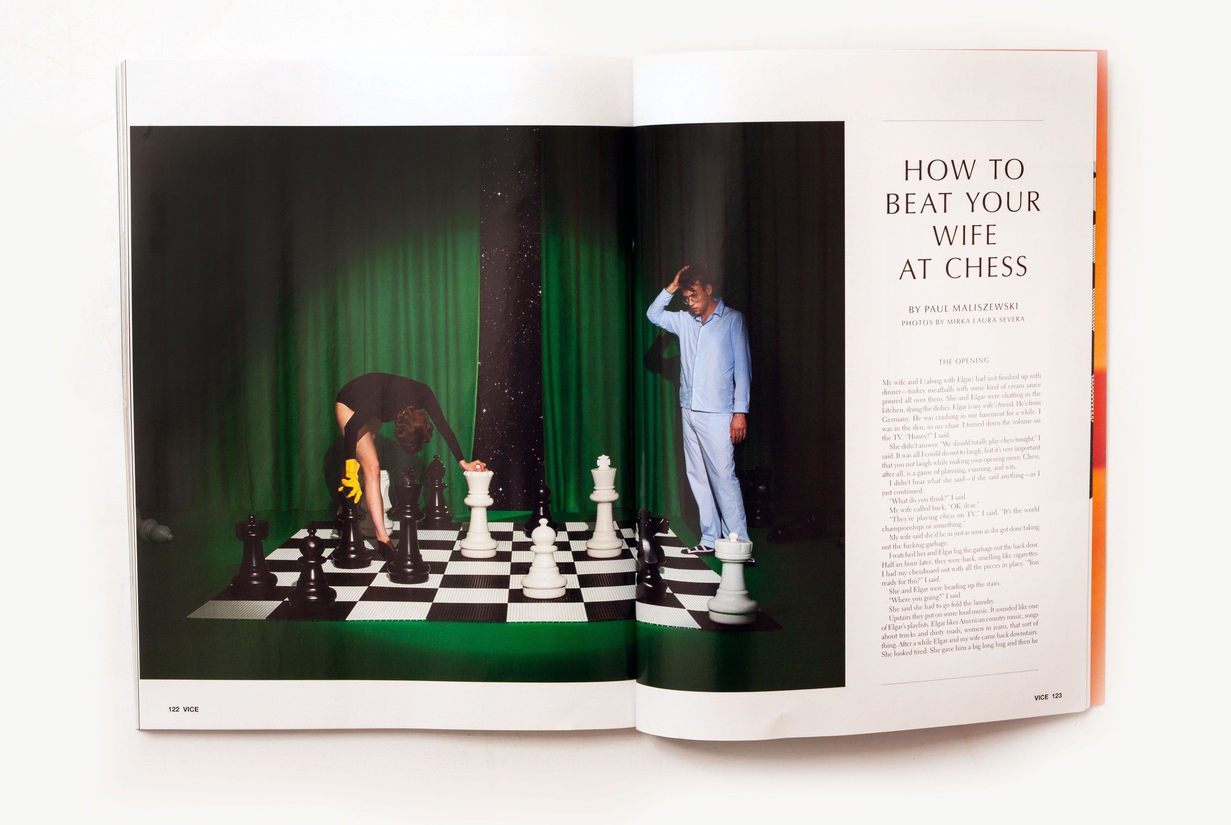
Small Brief 1 - Outcomes
These were my final outcomes, she didn't have any text to put on the pages so i used sample text and photo credits just to give the pages more context and increase the likeness to vie magazine.


Small Brief 1 - Research
The only research that i really needed to do what about vice magazine so i could get an idea of the typical layout. I wanted to look at enough images that i was familiar with the layout and would be able to replicate it.
Something that made it incredible helpful was an article detailing vice's recent redesign.
This article detailed the fonts used in vice magazine which i think was very important in creating the "vice" look.
I used images of vice magazine spreads to determine the location of the page numbers, the logo and how they were formatted.
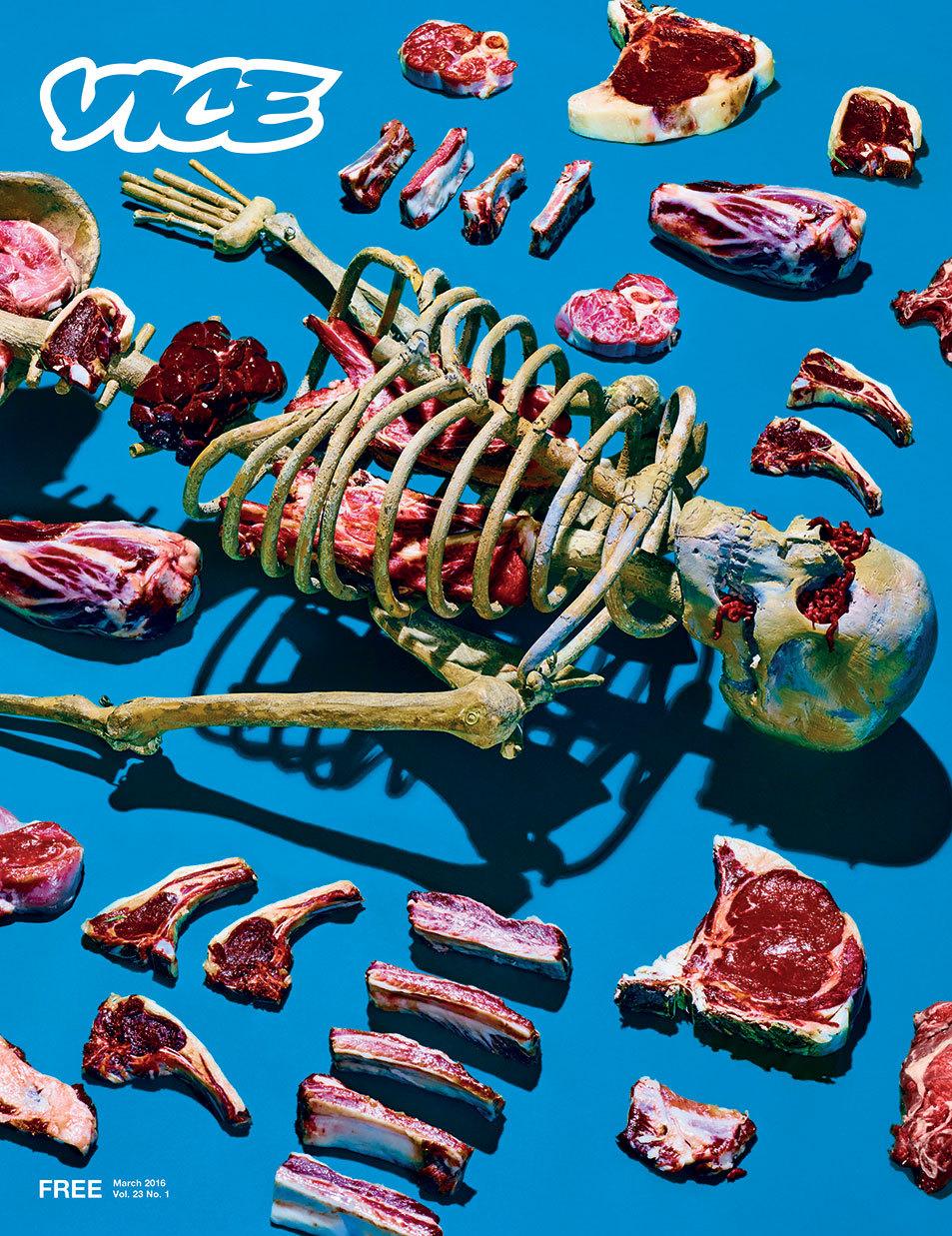
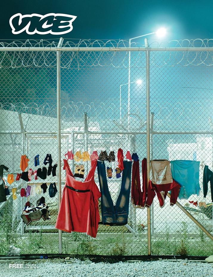
Something that made it incredible helpful was an article detailing vice's recent redesign.
This article detailed the fonts used in vice magazine which i think was very important in creating the "vice" look.
"Jones credited Vice's executive design director Matt Schoen for an attention to visual detail that boiled down to even the most minute differences between fonts.
After getting into "the nitty gritty of 15 different font sizes that look the exact same," to her, they settled on Electra and Helvetica Neue.
"I would just stare and him and be like "I don't even know how you see this,'" Jones said, echoing the thoughts of many a magazine editor in the face of their art staff's fervent design obsession around fonts. "
- http://mashable.com/2016/03/16/a-first-look-at-vice-magazine-s-redesign/#M.xUFRX_Zgq1
I used images of vice magazine spreads to determine the location of the page numbers, the logo and how they were formatted.
Small Brief 1 - Briefing
The brief: Create a layout in the style of VICE magazine to present the images.
Becky Nallon from second year photography had taken images inspired by Alfred Hitchcock, and they had been encourage to collaborate with graphic designers if possible to present them in the style of VICE magazine.
Deliverables:
A front cover
Two double page spreads
all in the style of vice magazine.
She had no specific requirements for how she wanted it to look as she "trusted my graphic Design knowledge"
Aims:
To improve and expand upon my editorial skills.
Saturday, April 1, 2017
Substantial Brief - Evaluation
Overall, i'm incredibly pleased with this brief. From the get go me and will were on the same page and it made it easy to come up with designs and we seemed to agree on pretty much everything. The only difficulty i had was when i created the first promo video. They had wanted a lot of minor changes to do with how the text appeared on screen however because i was sending the videos over email, each time i made a change i had to save and render the video. By the time we had finally got it how they wanted it i think id made and rendered over 15 different videos. Not only that, i had to find a way to make the video compatible to go on facebook. I done a few tests uploading the video and they were all blurry, sometime between the rendering and the uploading the quality was being lost. I spent a long time trying to figure it out and even moved the video to adobe video encoder to try and resolve the problem but nothing seemed to be working,. It turned out i just needed to turn on the HD setting in the video setting section of facebook and the issue was resolved.
Other than that this project went really smoothly. Not only that i have achieved all the aims that i set out in the beginning.
I was able to improve on my time management skills and be realistic when giving the band estimated times for finishing the work, i was also able to get all the elements completed for the times they wanted meaning i was able to work within specific timescales. I also had the chance to develop my after effects skills and produce a gif, which for me was a completely new skill.
Finally, the problem that inspired the brief :
"For this it was that they had no identity that could be used to promote themselves as a band, so my aim for this brief was to create an identity and promotional material for the band."
They now have promotional material that they can use, meaning that this problem was resolved.
Substantial Brief - Outcomes Resolutions
At this point in time I am really happy with the progress, more so because will is really happy with the designs and wants to continue working with me to create designs for merchandise and future EP and single covers.
At the start of responsive i wanted to undertake briefs that challenged me and would encourage me to learn or develop new skills. in order to do this I made a short video to promote the first single and pitched it to the band to see what they think. They absolutely loved it and were excited to used it and even created a short teaser clip of their song to use in the video. To expand on promo material they asked if i could make a gif that they could display on other social media, I had never made a gif before so i decided to say yes in order to keep challenging myself. The first video took a long time to make as i got more familiar with the layout of after effects but when it came to making the second video, it was a lot quicker and the band had no feedback or changes for the second video i made, which showed to me that my skills had improved.
Here are the two finished videos, gif and the final resolution for a poster for their upcoming gig which is currently on display in the library pub.
Substantial Brief - Development
Will had sent me a picture that he had taken whilst on holiday that he had wanted to use for something different but i felt for the single "half the world away" it was quite suitable as the landscape was very snowy which is literally a world away from the standard weather in Leeds. I really liked the simple circle design i had used in my initial designs because it was a very effective graphic and decided to apply it to this picture too. in order to be synonymous with the dream pop style i added a pink filter/overlay to the image. when adding the text i wanted to keep it very simple and "airy" which i felt captured the "dreamy" element of the genre so I chose to use quite a wide kerning. After that the only requirement from will was a white border around the image. i felt it worked quite well so i was happy to apply it to the design.


I was really happy with thew design and so was will and his band, that made the process a lot easier as we were able to settle on a design quite quickly. I was then able to apply this style and design to a header that he could use for social media.

This made the designing for the second single really easy, he sent an image he wanted to use for the cover and i applied the same elements to make a cover that had the same style as the first except this time I used a triangle as the next single was called "you"


For the cover picture i just used elements from the single cover, at the time of writing this i am yet to have feedback from will so i dont know if this will be used or i will have to change it.


I was really happy with thew design and so was will and his band, that made the process a lot easier as we were able to settle on a design quite quickly. I was then able to apply this style and design to a header that he could use for social media.
This made the designing for the second single really easy, he sent an image he wanted to use for the cover and i applied the same elements to make a cover that had the same style as the first except this time I used a triangle as the next single was called "you"

For the cover picture i just used elements from the single cover, at the time of writing this i am yet to have feedback from will so i dont know if this will be used or i will have to change it.
Substantial Brief - Idea Generation
The band had already chosen a typeface off some sort of photo editing app, but i made them aware of potential problems when it came to licenses surrounding typefaces. To resolve the issue i used font library dafont.com searching for a type face that was 100% free so that they didn't have to worry about spending money as they were a band just starting out and didn't have the budget for buying typefaces. I used the example text feature and typed in their band name, scrolling through until we found a typeface everyone liked, this turned out to be a typeface called Roboto.
When it came to coming up with ideas, I wanted to work around the colour pink as it was quite common within the research i had done. I also used the names of the singles to influence the design of the covers. The single names were "you" and Half the world away. I broke these down into basic elements and to represent "you" i used an upside down triangle to simulate the Y, for half the world away i used a circle with a line through it. I used these as the base for my design.
To create a starting point I found an image on unsplash.com that was royalty free and I could use to just play around with some ideas. Using pink as my focus i found an image that contained this colour.

I minipulated this image to become more abstract by using the smudge tool and playing around with the colour settings.
I then used the lasso tool to select a circle and a triangle, adjusted the size and placed it over the background.


I liked these as a concept and felt like they were a good starting point but I wasn't 100% happy with them, the feedback from Will was positive though and that reassured me that we were on the same page where designs were concerned.
I transfered this concept to a header that could be used temporarily until I had finalised a design.

Substantial Brief - Research
When discussing what the band wanted in terms of a look they said that they wanted something that was synonymous with the genre "Dream Pop" So my starting place for research was to find out what bands were considered dream pop, what bands they were influenced by and listen to some music by the band and the bands they were influenced by.
After that I simply used a google image search to look up "dream pop" and then the specific bands they mentioned.


I used these as visual aids for creating a certain style but i didn't want to look at too much more because I wanted my idea to be original and I have identified that sometimes i can be easily influenced by visual research. I felt that at this point this was sufficient research for giving me a good idea of the kind of styles and colours used within the dream pop genre.
Responsive Substantial Brief - Briefing
In order to work out a time plan and a specific brief I meet up with the band members to discuss in full detail what it was that they wanted.
Their initial request was for a single cover and two ep covers and they had a really specific idea for what the wanted. We spent a bit of time discussing their ideas and it turned out the only things they would require me to do was to crop and image, adding a border and text and to clean up a graphic one of the band members had already done.
At this point i had to be brutally honest with the member's of the band, the task they had asked me to do didn't require any creativity or skills, it was something they could most definitely do themselves, so I offered them an alternative that would actually utilise my skills as a graphic designer.
I proposed the idea of being more open minded with what they wanted and rather than staying settled on what they already had, allow me to create a brand surround their band. I would assign a typeface, colour scheme and style to the band that would be applicable to all social media and printed media in order to create a band identity that would be cohesive and recognisable. I would then use this to influence the graphics for their single covers, ep covers etc.
They were extremely happy with this idea as it was something they hadn't considered and that is how we decided to proceed. We then discussed the time scale for when they wanted different aspects designed for and specifically what things they would want, we had a long discussion with input from both sides and this is what was decided:
Deliverables:
Type face
Deadline for this was the 12/02/17
Colour pallet
1st Single Cover
Headers for social media promoting first single
The deadline for this was the release of their first single which was 01/03/17
2nd single cover
Header for social media promoting second single
Poster for debut gig.
The deadline for this was the 27/04/17
Before starting this brief i needed to identify a problem that needed to be resolved. For this it was that they had no identity that could be used to promote themselves as a band, so my aim for this brief was to create an identity and promotional material for the band.
Responsive Module - My Chosen Briefs
Substantial brief:
When choosing a substantial brief, I think like everyone, I went straight to competition websites like YCN and D&AD. When looking through the websites nothing really jumped out at me or caught my attention. I began looking around at alternative websites but luckily at this point in the module a friend had messaged me about doing an album cover his band, This was something that interested me as i had never done it before and being able to have a discussion with my friend about the deliverables for the brief seemed a lot more appealing to me than a competition brief so this is what I settled on for my substantial brief.
Smaller briefs:
One of my housemates is on the photography course, for one of her briefs she had to do a shoot and put it together to look like a pre-existing magazine. She passed on my name to a friend off her course who had to do the same thing but for a different magazine. These briefs felt easy enough to be considered small briefs but substantial enough to require research and certain skills that the photographers didn't have.
Other briefs:
Keeping time management in mind, I would like to complete a piece of work to submit to NEST but that will all depend on how much time I have running up to the nest deadline.
Responsive Module Brief
"To enable students to work cross-course, understand cross-disciplinary approaches, work collaboratively or respond to an external event or activity with a significant pedagogic value."
With this in mind, it will be of benefit to me to pick briefs I feel will enhance my knowledge and/or skills. It will be an opportunity to work in a different way and test my confidence in these areas.
For my individual practice, these are the lists of points I needs to keep in mind:
With this in mind, it will be of benefit to me to pick briefs I feel will enhance my knowledge and/or skills. It will be an opportunity to work in a different way and test my confidence in these areas.
For my individual practice, these are the lists of points I needs to keep in mind:
- How do you balance what you want to do, design or produce with what the brief requires?
- Do the briefs offer enough breadth and scope for the development of a range of responses whilst at the same time allowing you to focus your practice?
- What are the realistic timescales for completing the brief? Are you working to these?
- Have you clearly identified what the problem is before you start?
- Where is the challenge in the brief and what will you get out of doing it?
- What do you need to present and how will you present it?
Responsive will give me more creative freedom and the chance to work on things i'm genuinely interested in. This may make me take on more than i will be able to get finished, so in relation to the first point, it's important that I make realistic goals within the briefs i choose and be careful not to get carried away.
In response to the second point, part of the challenge of this module is to ensure I produce a significant body of work that utilises the time efficiently and effectively, meaning I dont aim to produce to little work or too much work. I also need to be able to display my ability to respond to deadlines and within different time scales and the development of different ideas.
In terms of timescales, it is important to manage my time effectively to make sure I am able to meet deadlines and stick to timescales. Part of this will be working on my time management skills and being realistic with how long it will take to carry out a certain task.
To make my graphic responses successful, it will be important to identify a problem at the start of each brief in order to guide and influence my ideas, this means at the end of each brief i should end up with a piece of work that resolved the problem and answers the brief successfully.
The whole point of responsive is to respond to briefs that will be of value to us in the long run, so in relation to the second point it is important to try pick briefs that are new/different to what I have done before. The challenge for me within this brief will be time management and being able to realistically estimate how long certain tasks will take to complete. Where possible i would like to create a graphic response which is different to what i have done before ensuring i can develop new skills.
At the end of these briefs i will aim to have completed and fully resolved graphic pieces. As I have not chosen the briefs yet I dont know specifically what I will need to present my work or how I will present it but with all pieces of work to complete, i would like to display it using my social media in order to promote myself. So at a minimum i will need a social media platform (which i already have) and digital versions of my work.
My personalised aims for this responsive module will be:
Improvement of time management skills
Development of new or existing skills
Subscribe to:
Comments (Atom)