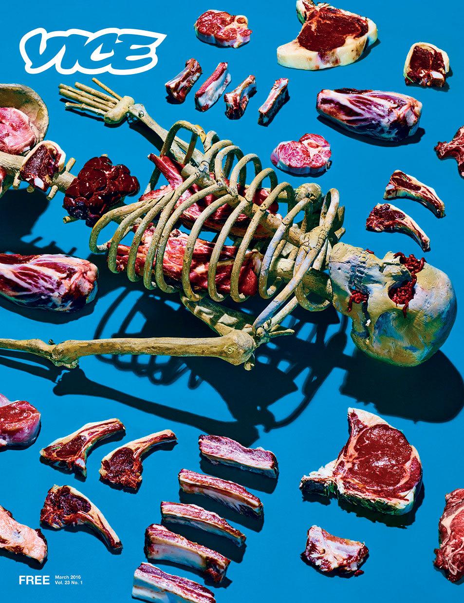
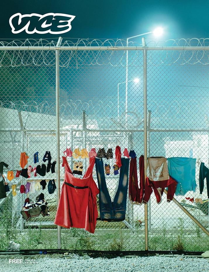
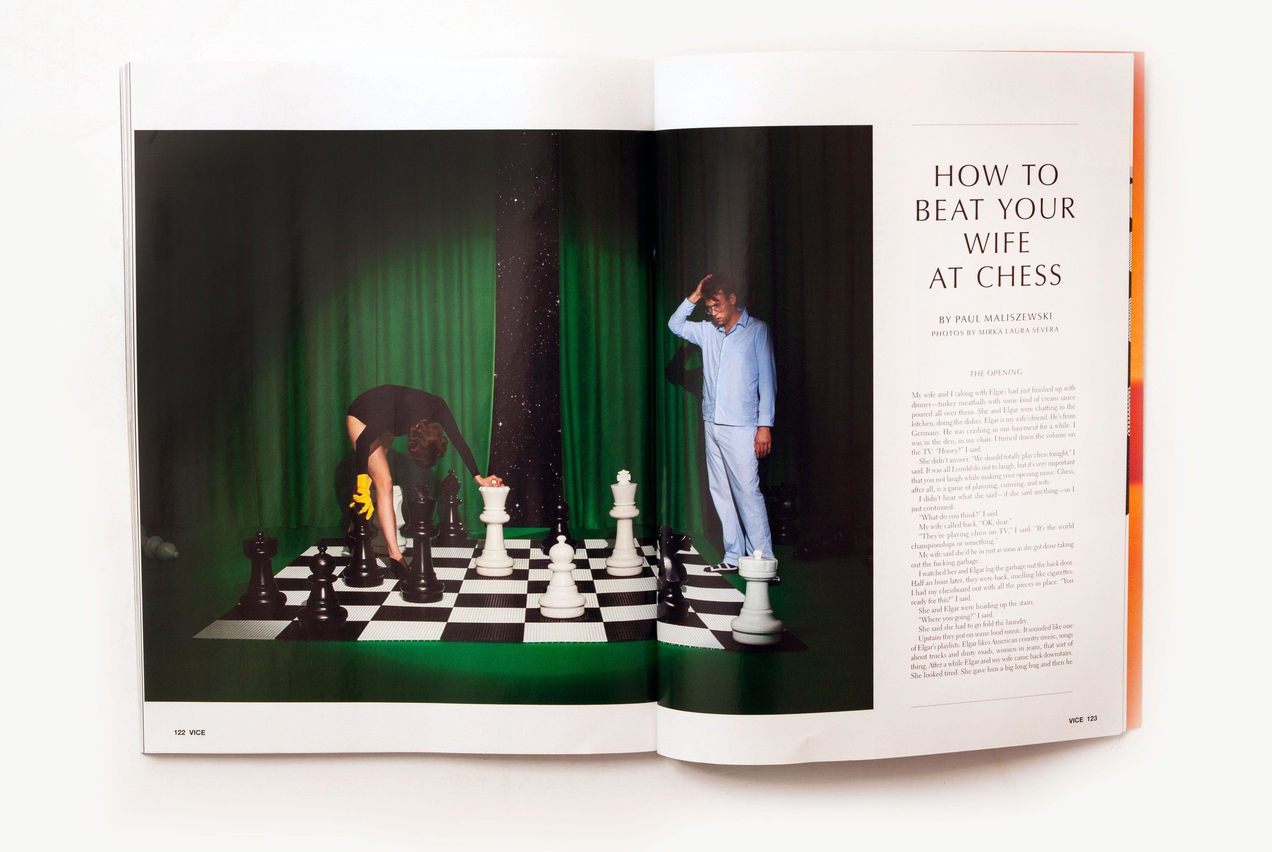
Something that made it incredible helpful was an article detailing vice's recent redesign.
This article detailed the fonts used in vice magazine which i think was very important in creating the "vice" look.
"Jones credited Vice's executive design director Matt Schoen for an attention to visual detail that boiled down to even the most minute differences between fonts.
After getting into "the nitty gritty of 15 different font sizes that look the exact same," to her, they settled on Electra and Helvetica Neue.
"I would just stare and him and be like "I don't even know how you see this,'" Jones said, echoing the thoughts of many a magazine editor in the face of their art staff's fervent design obsession around fonts. "
- http://mashable.com/2016/03/16/a-first-look-at-vice-magazine-s-redesign/#M.xUFRX_Zgq1
I used images of vice magazine spreads to determine the location of the page numbers, the logo and how they were formatted.


No comments:
Post a Comment