Monday, November 16, 2015

OUGD403 Studio Brief 2

Research


To begin with I did a mind map of what the word empty means to me and then I did a Google search to get a definition and synonyms of the word to make sure I considered all aspects of what the word empty means and represents.The main ideas I has were very loose kerning to give the words a feel of an empty area. Lots of open space within the actual letters. No fill,  a more literal representation of the word empty. Very simple design/lack of detail, this is a little less little and is more a representation of the word, it also has connotations with having no content, and being bare.                    


I spoke with a group about my word to find out what it means to them or how they would visualise it. One member suggested a song to see if it would give me any inspiration. Combined I think these are all aspects that I want my typeface to have, I would like the typeface to embody a range of explanations for the word empty so that each person who views it can identify with it.


To get an idea of how other people have tried to represent the word empty in a typeface, I simply typed in ‘empty typeface’ to get the most basic result and see what came up. I feel like these three typefaces embody what I have been looking at so far, a partial typeface, an almost stencil like typeface with a lack of detail, and a typeface with a lack of fill, suggesting emptiness.

I explored each font and created a  manifesto so that i had a better understanding of the typefaces and how I could utilise the traits to reflect the word I had been given.
Garamond
A versatile serif font that ha deep historical context, yet a contemporary and harmonious design. Legible in a number of sizes, weights and languages, it was built for the very purpose of disseminating a complex and significant range of information.
Caslon
A serif typeface with short ascenders and descenders, has the specific purpose of fitting more characters on a page whilst at the same time leaving sufficient blank space for aesthetics and legibility. The italic form has a rhythmic calligraphic stroke that makes it easier to read when in a body of text. There is a moderately high contrast amongst the letter-forms; this gives the typeface a formal identity. The italic P, Q, V, W, and Z all have a suggestion of a swash giving the font a hand-rendered feel.
Baskerville
Created by an illiterate, self-taught printer, considered to become of the most legible typefaces there is. Due to its academic qualities, it is used by many universities to make statements stronger and more believable. As Baskerville was a perfectionist, its crisp edges and embellishments and long running history make it a classic. It is considered an elegant, soft but strong, fine quality typeface. 
Clarendon
A strong British type created to reflect the aspects of the Victorian British Empire. The thick strokes melding into thick slab serifs and fat ball terminals represent the hearty and unstoppable aspects of the British Empire. Clarendon's increased contrast, opening the counters, allows it to be used on short passages of text.
Helvetica
Created specifically to be neutral, to not give any impressions or have any meaning in itself. The neutrality was paramount, and based on the idea that type itself should give no meaning. It was the direct opposite of the fancy and decorative typography that covered advertisements at the time.
Univers
Swiss designed sans serif typeface, known for its legibility due to it being the first typeface to form a family of consistent designs. Due to its legibility it is used for a lot of signage. In terms of design, the typeface has tall x-heights, It is a neutral design with a very subtle yet visible contrast in the strokes. This slight contrast in stroke combined with curved terminals gives the typeface a sense of uniqueness, The added curves also give a sense of friendliness which along with the legibility, make it ideal for its usage throughout UK tests and exams.
Berthold
created in the wake of the industrial revolution, a sans serif font with a primary use in industrial advertising and large signage. The less rigid, geometric form of the type positively impacts the legibility of the type and the many variations make it very versatile. The understated forms of the type, and idiosyncrasies set it apart from other typefaces and make it perfect for statistical information with an emotional undertone. Simple in a time that was far from simple; this is one of the first typefaces to have a fixed stroke width, making it the original sans serif typeface.
Times
one of the most familiar and successful typefaces in the world, exceptionally legible design that translates well to hard copy and on-screen environments. designed for a newspaper, so slightly narrower than most text fonts.


The most obvious route to go down was to make the text literally empty by using no fill. I used Univers for this experiment as it’s a fairly slab like, geometric font, so there would be lots of space within the letters, especially as the weight of the letters are increased. I didn’t want to leave it at that for this experiment so I took the bottom off each of the letters playing with the idea that without them, the letter wouldn’t be able to be filled, so it’d always be empty, like an upturned bottle. 


For this experiment I used clarendon for its thick strokes and heavy weight, I feel like a lot could be taken away whilst the serifs made the letters identifiable. I started off by tracing the word. I decided to do this experiment hand rendered because I wasn’t quite sure what the outcome would be and I felt it was easier to experiment by hand.. For my second experiment I wanted to take whole parts of the letter away. In order to avoid it being like  lettering where it only works in the context of the word, I added lines through the word, almost like guidelines to ensure each letter was treated the same, creating uniformity. I really like this idea as the missing parts of the letter resonates with me and I feel like it effectively communicates a feeling of emptiness and being incomplete.

I looked back to the manifestos of each other typefaces and decided to do an experiment with Helvetica. A typeface specifically designed to have no personality, no emotion and no meaning I think it will be perfect for what I am trying to achieve. Also as a sans serif font, it has less detail, again reinforcing the idea of no content and emptiness. Rather than apply the guidelines from the previous experiment, I tried out a new method that was a little less structured, my only rule being to try to only remove the inner lines. 
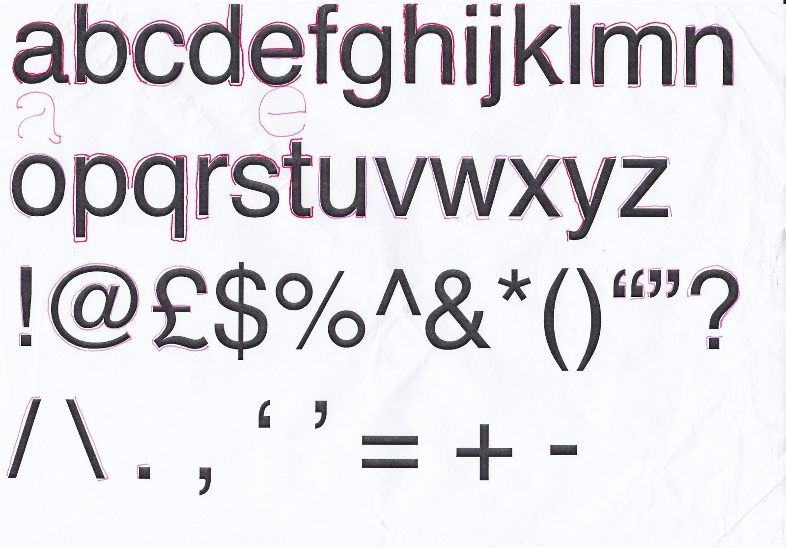

In order to produce a full alphabet I printed letters a-z and using a pen, I identified the key areas of the letters I wanted to keep, where possible removing only the inner lines. I made the decision to only do lower case letters as I felt that uppercase letters are reminiscent of shouting and therefore have many emotional connotations.

When deciding on a name I wanted something to represent the lack of emotion, meaning and detail. To me the word vacant described that perfectly. I decided to translate it into Spanish as Spanish is considered the most basic and easiest language to learn thus giving me the name: Vacante.

Manifesto:
A deliberately limited and vacant typeface,
Vacante is a minimalistic typeface that
derives from Helvetica. Vacante is ideal for
headers but could be used for small
amounts of body text or captions.


I love how this turned out and I produced something I am very happy with. I thoroughly enjoyed the challenge that was presented to me in this brief. After receiving final feedback I would probably adjust how I have presented my final resolution as people have focused a lot on the idea of It being like a light or glowing rather than the letterforms themselves, however it is clear from the feedback that I was able to find the right balances when removing parts of the letters as not one person found it hard to read or illegible. Another thing I need to be aware of is the weight of the lettering, having it too heavy means that the letters start to lose the feeling and look of being empty. If I were to ever return to this I would try spend more time adjusting the base letterforms to make them softer, in order to create an uppercase version. I think I successfully fulfilled the aims I had for this brief.

Monday, November 2, 2015

Type Setting Lecture Notes

Typesetting lecture 2/11/15

‘The grid represents the basic structure of our graphic design, it helps organise content, provides consistency, gives an orderly look, and projects a level of intellectual elegance that we like to express.
– Vignelli, 2010

The more columns the more flexible the grid is.

The grid is always informed by certain design decisions.

Legibility:  The quality of being clear enough to read.

‘Line lengths that contain 45-65 characters are legible… Line lengths exceeding these limits, challenge legibility’.
– Fassett’s theorem of legible line length.

Main factors that affect legibility:

-typeface
-serif or sans
- X height

Readability: The ease with which a reader can understand a written text.

The way in which words and blocks of type are arranged in a layout.

-tracking/kerning
-leading/line height
-type size
-contrast
-hierarchy

Type size
No more than two type sizes on a page but there are exceptions.

Alignment
“It is important to control the shape of the rugged side by shifting sometimes the text from line to line in order to obtain a better profile. This maybe time consuming but aesthetically rewarding.”
-Vignelli, 201

In typography, “rag” refers to the irregular or uneven vertical margin of a block of type. Usually it’s the right margin that’s ragged (as in the flush left/rag right setting), but either or both margins can be ragged.

Main types of alignment:

Flush left: usually leaves a very uneven rag on the right hand side when not edited by soft return or manually tracking.

Centred: Very difficult to read and tiring on the eye.

Justified: Eyes very quickly realise that lines start and end in the same place however, you are left with something called rivers. Rivers are lines that appear when you adjust a body of text. These appear because there are massive gaps between certain words.

Orphans and widows.

A widow is a very short line, usually one word, or the end of a hyphenated word at the end of a paragraph or column. A widow is considered poor typography as it leaves too much white space, interrupting the reader’s eye and diminishes readability. Fix them by reworking the rag or editing the copy.

An orphan is a single word, part of a word or very short line, except it appears at the beginning of a column or a page. This results in poor horizontal alignment at the top of the column or page. The term “orphan” is not as commonly used as “widow,” but the concept is the same, and so is the solution: fix it!

Opinions

“I don’t think type should be expressive at all. I can write the word dog…and it doesn't have to look like a dog. But there are people that [think that] when they write ‘dog’ it should bark” – Vignelli, 2010

Modern Magazine Conference 2015 notes

Modern magazine conference 2015

Mag culture
‘The new normal’
The idea that print isn’t dead and a collaboration between print and digital is the new normal
This era is called post-digital

David lane – The Gourmand

‘A manifesto for a magazine’
Food is the world’s most universal subject.
Can’t produce anything worthwhile solely, collaboration is a necessity.
Keeping screen and print separate as you can’t recreate the feel of a publication on screen so there is no point trying. Rather than repeat what is in print, they have created bespoke content for the website.

Andrew Tuck - Monocle

‘How to reflect a print brand in audio’
10,000 print run increased to 81,200 copies
By adapting their concept through their podcasts they have 800,000 listeners per day
Underlying theme - How to make money
How to make money whilst maintaining their ethics, how to have adverts without compromising their message
Monthly, turned into weekly into daily into live broadcasts.

Grashina Gabelmann – Flaneur

“Inside a unique editorial process”
Each magazine is one street in one city. Art, design, culture, shopping, all within the street.
On their website have a section named unprintable’s, a section of audio clips, videos etc. that can’t be recreated in print.

Sophie Lovell – Uncube

“Adapting the print experience online”
Not adapted, imitated.
Purely digital magazine about architecture.
Instead of digital vs print, they wanted to bring them together instead.
Layout of the website designed to look like a double page spread making an immersive experience.
Skeuomorphism is the design concept of making items represented to resemble their real-world counterparts.

Louis-Jacques Darveau – The Alpine review.

The magazine as platform
Content should be diverse and informed by many fields in order to encourage a chain reaction and inspiration the audience to continue the exploration.
So in depth and informed that there is no time frame

James Fairbank – Rapha

“Transferring Rapha’s brand content from digital to print”
95% of their sales are direct as a result of their website
Started funding a magazine; however their advertising contradicted Rapha’s message.
They don’t need to adhere to editorial rules as it is completely funded through raphe. Gives them the freedom to explore things they couldn’t do online.
Online contentment is about immediacy, people are more likely to dedicate more time to a physical print.

Bertie & Char – The Mushpit

“From zine to glossy to…”
Born out of frustration with magazines that are aimed towards young teenage girls.
Create a magazine that went against the mainstream message of what teenage girls should do and encouraged girls to just be themselves.

Matt Phare – Shortlist

“Creativity in free magazines”
Create a magazine that was free of the restraints from mainstream publishing.

Charlotte Heal – Kinfolk

“Behind the scenes of a rebrand”
Her process of rebrand and how the content was adapted to her design process.

Scott Dadich – Wired US

“The past, present and future of wired”
Pitched the idea of an iPad for magazine consumption and even though the iPad was incredibly successful, only 1.1% of their readership came from iPad’s. However 70% of their readership is through their website. The website is designed to work on a phone, not on a computer because most people consume though their phones.
Readership each day of their website is 30 million.
If they stayed as a print magazine, they wouldn’t have been able to undertake exclusive interviews and gather exclusive content.

Kati Krause – Writer and editor

“What websites must learn from magazines”
Things need to be adapted for phone.
People need to be able to curate their own content.
Digital allows immediacy which is the future of digital content.
Design for the limitations on a phone, and the colour limitations etc.

Ibrahim Nehme – The outpost

“Can a magazine change the world?”
Imaginary world where all Arab countries live in harmony and celebrate culture and architecture etc.
‘Tear this wall down’ encouraging people to find ways of doing things they think aren’t possible.

Friday, October 23, 2015

OUGD403 – Studio brief 1

Logotype


For my re-brand I chose to do subway, the reason I chose subway is because their logo has been the same for as long as I can remember and overall it just doesn't look very inviting in terms of being for a fast food sandwich company, the main reason I think this is because of the garish yellow and dark green used in the logo.
Therefore my aim for this re-brand was:

"Create a more succinct, contemporary logo that appears refreshing"

To begin with, I went to subway and took pictures within the shop mainly looking at the applications of the current logo. These included napkins, bags, cups and the paper the sandwich was wrapped up in. Other uses included the shop front signage and the employee’s uniform.


After this I looked into the company’s history and the story behind the name so I could decide if any of these factors would influence any of my design decisions. As subway is such a popular and well recognised company I decided not to change the name and it has fairly substantial reasoning behind the name (submarine sandwich made your way; Subway) As for the history of the company, I wanted to find out where it was originated and if this would have any impact on the style of my design. My initial idea was to do something related to the new York subway and Helvetica as I though subway would have originated in new York. The actual company was founded in Connecticut, however it is thought that the sub sandwich itself could have originated in new York so I decided to keep that avenue open.


After identifying the applications of the logo I needed my design to be legible on large and small scale and not too complicated.

My first design is based on Helvetica, I gave it a quite tight kerning as there are normally some problems with ‘b’ and ‘w’ next to each other and I wanted the word to be as cohesive as possible. I wanted to incorporate the arrow as a link to the old design so modified the ascender to flow seamlessly into an underline/ arrow. I like this design but I think it is too simple so would need some further development.


In order to make it look more like a sandwich shop, for my next design I took inspiration from a restaurant called Byron burgers and the font they use.


I was able to find a similar font called Porter. From a student’s point of view the price range at subway is fairly expensive considering what it is and you could easily get a sandwich with fresher ingredients elsewhere for cheaper so I decided to keep the kerning on this logotype quite loose to give the feel of a more expensive food branch. I also did a variation with lines in order to make it look more up market. To give the design more context I did a version where the design was placed on a rustic wood background.

 Subway recently brought out a new sandwich called the new beef pastrami melt inspired by New York. I really like the front of the use on their promo posters and decided to take inspiration to create something similar. I found a font called Air Americana resembled the one used in the promo posters.


There were some issues with the lettering especially on the B and the A and so I edited them in Adobe illustrator until I was happy with them and they looked more streamline. The font is oblique and I felt that worked well with subway being a fast food chain but also the layout of the service where you go from left to right to make the sandwich.
Again I wanted to incorporate an arrow into the design so I added a simple underline that doubled as an arrow. I think this could be devolved with more time in order to find a way to incorporate it in a more seamless way and in a way that looks better.
 Looking at the promo posters again I noticed there is a stripe down the middle of the letters and I really liked this aspect and decided to add this to this typeface.

I really liked how this turned out and I thought that if the lines where changed into lighting it could work well as signage.


After doing research into colours that stimulate hunger, orange and green were at the top.

The darker green and yellow are the original colours for subway, i feel like the dark green in no way represents the 'freshness' of the brand that they are trying to promote so i opted for a lighter green and the orange as a potential alternative.


I liked the green the most as it looks the most light and refreshing and retains some of the original brand identity.

Feedback

Overall my feedback told me that my re-brand was successful and i managed to achieve the aims i had set out for myself. All the comments we're positive and agreed with my choice of final resolution which was very reassured me and gave me confidence in my design. However there were two issues that quite a few people picked up on. the first was the colour, although it was agreed that the lighter green was definitely better that the original subway green, there were concerns that it would stand out very well. The second concern was with the lines in the middle of the text, on a smaller scale it was hard to see that they were there. If I were to revisit this i would rectify the aspects of the design that were flagged up as issues by increasing the stroke weight of the line and choosing a darker green that is lighter than the original green used by subway but that is still noticeable.

Monday, October 19, 2015

Experimental Jetset Whitney Rebrand.


Initially, I felt that it was visually heavy on the left hand side as it has the bold text of the 'Whitney, and on the right, is just open, white space. However the bold text versus the slim, sleek 'W, compliment each other.

The Simplistic, sleek, modern look means it works well in black and white and would also work well in many other colours and is very versatile in terms of the colour choice to compliment the logo.

They made the decision to not keep the form of the 'W' so depending on the context the 'W' acts as plynth to showcase the work holding it up or wrapping around the work to frame it. The zig zag is also shorthand symbol for all kinds of instructions from musical notation to stage directions, therefore represents the diverse content of the whitney museum.

As it is, the logo looks really formal however when put into context and the 'W' is distorted it becomes more playful and informal meaning that.

Obviously as we have a certain level of visual literacy, lot of these factors that we've noticed may go unnoticed however. i think that adds to the how effective the rebrand is.  The 'W' frames the work so well it almost goes unnoticed. The W achieves the aims set out by the designers on a number of levels it reflects the architecture of the building and it works seamlessly with the artwork in order to frame it and advertise it successfully. Overall I think this was a very successful rebrand.


Monday, October 5, 2015

OUG403 - Study Task One Feedback.

Feedback.


Overall, the main points of our peer feedback were:


- Good research into the company and understanding of the companies services and dedication to customer service.

- Thorough research into typeface and colour and  justification of design decisions.

-Good experimentation regarding colour and the name change and was agreed that our choice was the most effective out of our experiments

-The use of the flame within the counted was visually effective and didn't effect legibility.

- There could have been more images within our presentation and less writing.

- Could have done more research into other companies i.e. naming conventions. 

Tutor feedback:


- Good observation and critiques about current logo however we said the current logo was unfriendly but we didn't say why.

- Presentation could have less text and could have been replaced with visual examples.

- Good investigation into use of colour

- Good use of type terminology.

- The kerning needs improving

- Some felt the blue and the idea of 'heat' were contradictory.


General feedback to the class:


Outstanding presentation skills but more confidence is needed in the work we have created. we were enthused and passionate about the work but need to avoid using terms such as 'nice' and 'good'. 
We need to consider and reflect on the most difficult aspect of the task
Try and link design decisions to recognised theory and avoid over complicating things.