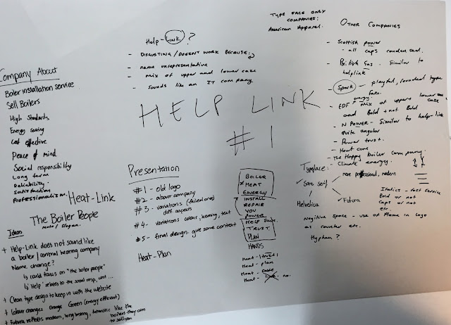
The first thing we did was Google help-link and write down out initial thoughts about the current logo and find out the specific information about our company.
There were a few areas that we had to consider:
- mission statement/unique selling point
- Values
- Vision
- Personality
The main problems we identified were:
- The name
- The mix of upper case and lower case
- The kerning
- The '.co.uk' underneath the main logo
We had a problem with the name as we felt it wasn't very representative of the company, we initially thought it was some sort of IT company and not a heating company as none of the works convey anything to do with company.
The mix of upper and lower case is unsightly and there doesn't seem to be any reason behind the design decision that we can think of to justify this choice.
The irregular kerning makes the logo look amateurish and again looks unsightly as the letters look disjointed.
As we are in the digital age and most companies have websites the need for the '.co.uk' has been lost and is unnecessary, it makes the logo look less fluid and unbalanced as it is underneath the main type.
We decided to resolve the issue regarding the name before trying out any experiments with type. In order to do this we looked at the company websites 'About' page in order to identify the core values of the company and to gain inspiration for the name change. We narrowed this down to a few key words such as heat, energy,power etc
We decided that the word 'heat' would be most suitable as it is the most accurate reflection of the companies services which is central heating. Our first option was to just change 'Help' to 'Heat' to become 'Heat-link' but as a group we decided that it still didn't accurately represent the company.
So following suit with the help-link name we decided to pick a second word to follow the word heat.We started looking into words that reflected their attitude towards their customers and service. As they pride themselves on their customer care and being customers first choice we looked into words such as trust, first, plan etc. Out of these we felt the word that best fit and was the most effective was 'first' and so we had decided on the name change of 'heatfirst'
This brought us onto the design process and our next task was to pick a suitable typeface. The company is fairly new and still expanding so we initially decided that a serif font wouldn't be appropriate as they are closely associated with companies that have a long standing history. Also we felt that a target audience of the company are perhaps new house owners who are looking to upgrade to a new more efficient boiler, therefore a typeface that would appeal to a younger audience eg 25-30. The design of the current website include a sans serif font for the content of the site and they also have fairly minimalist/simple icons, another reason we decided a more modern/sleek type face was the way to go.
So out of the 6 basic typefaces that left us with the choice between helvetica and futura. We compared the two typefaces and decided that futura has a more rounded appearance and that fit well with the friendly aspect of the company that we were trying to convey.
The two experiments in black are in Helvetica, jut to make sure we were content with our choice of Futura and at this point we agreed we wanted to stick with Futura.
We decided on our final resolution for many reasons:
firstly we decided on the colour blue as we didn't feel like the orange worked because it separated the words too much and we wanted 'heat' and 'first' to be as cohesive as possible. As their main focus is central heating we though a blue colour would be best to represent gas. We chose blue over orange because as a group we felt that blue had connotations with feelings of trust and reliability, company aims that we wanted to put across to the the customer.
The decision to make the words as cohesive as possible also lead us to keep the words side by side a opposed to on top of each other.
We wanted to keep the flame from the original logo and we felt that adding it in would give the our logo a little more 'heat' as we identified that blue could come off as quite a cold colour. After our typographic lecture we were inspired to try and incorporate the flame into negative space as opposed to at the side or above etc. therefore keeping the logo concise.
We decided to link the T up to an underline for two reasons:
The first being we wanted to maintain the 'link' aspect of the company and the links they have to helping out and giving back to the local community and also the pride they put into open communication with the customer.
The second for visual reasons, the word 'first' is in a lighter shade of blue and we didn't want it to be drowned out by the darker 'heat' so we felt having the line kept the two words cohesive.


No comments:
Post a Comment