Wednesday, December 28, 2016
Type in context - Commercial considerations.
As this book is aimed at travellers, the primary place i would like to put this book is in hostels across Madrid and Barcelona. Most hostels have a designated area where all leaflets and booklets are kept that relate to the surrounding area. I know from experience that when going in to a hostel, finding this designated area is one of the first things i do to try and best organise my trip. I feel like it would be really nice for this to be there because it is a little different to what people usually see in these spaces and hopefully that would encourage people to pick it up. I would love for this book to be viewed in context and maybe even have someone stumble across the Places i photographed whilst on their own travels but i also love the idea of them reading it/looking at it over lunch or whilst they are on their way to an adventure/outing. As the book is so cheap to produce it is something I could really consider putting out for free, something i would love to do as i want to appeal to The traveller demographic which is try get free things were possible.
Type in context - Finishing and binding.
Like i had talked about in my research i had planned to use a thicker stock on the cover that would allow it to resit wear and tear and little easier, when doing my experiments i experimented with some brown card that i just had lying around however i actually really loved how this looked and decided to use it for my cover. I feel like the colour of the paper really reminded me on canvas backpacks found whilst travelling around, which fit perfectly with my book.
For the thread, i new i wanted to use a red colour as a little homage to the places where the images were taken, red/dark red is contained in both the Madrid and Barcelona flag so i though it would a good way of tying that into the publication
I also went with this maroon/red colour for my book title. Overall i think the colour looks really nice against the brown paper and i am extremely happy with the result.
Type in context - Printing
I was originally going to get the book printed in the digital print room at college, however at that time the print room was fully booked out and the print room technician was ill, making it almost impossible to get it printed in college. When thinking about how i was going to resolve this problem, i though back to the whole concept of a zine and how they were usually low budget productions with certain unique qualities such as the differences between each one whilst making, binding or printing. It was due to this i decided to print my book on the standard printers around the college. As the images were quite small i knew that it wouldn't effect the quality all that much but there were certain aspects of printing it this was that i really liked. The first being how cheap it was to print (£1.50 each copy) and that each print may be aligned ever so slightly different to each other, giving it a more organic hand produced feel, something that is synonymous with zines.
Printing was fairly easy as I was able to use my knowledge from the indesign workshops to print it. I was able to set it up to print 2 up saddle stitch making it incredibly easy to bind together as all the pages were in the correct order.
For the front cover I am going to screen print. This is again inspired by cost considerations for production. With a screen print it is very easy to do multiple pulls really quickly and the ink and medium is incredibly cheap. Not only that but by using the facilities in college, i was able to re-purpose ink that people had finished with, again cutting down on the cost. Another reason i chose screen printing is because the print is not always the same/perfect on every pull and that would be chance id have to take when printing on to my books but I really like that aspect of printing as it makes every print unique.
Type in Context - feedback
I Showed an early version of my book to a crit group and got some feedback on what I had done so far.
At this point i had used Futura for my front cover and Garamond for the body text and one of the questions i asked the crit group was if they felt this pairing was suitable/complimentary.
Overall there were no problems with the typeface pairing and they seemed to work quite nicely together as it was a serif and sans serif combination, but as i had used movie scenes within my book it was suggested that i could use a typewriter font that would draw the link to the text being quotes from movie scripts, this was a suggestion i really liked and later implemented into my book.
A comment was made that the concept of the book was a bit too ambiguous/vague because I hadn't written what the book was about/doing and I hadn't labelled the movie quotes which made it hard for the reader to understand what was going on and tie a link between the movie scenes and images.
I went back and added the name of the movie underneath the quotes and added a preface to the book explaining the concept. This made it a whole lot easier for the reader to engage in the book.
It was also suggested that the "type in context" part of my title wasn't really needed. As i was trying to keep my book as simple and refined as possible i really like that i could refine it even more and didn't hesitate to remove it from the title.
Type in context - Selecting content
In order to select the actual content for my book I chose the images I liked the most from the ones i had taken and started from there. This pictures I had were comprised of a bar, an Italian restaurant, a hotel, and a shop. From that point I tried to recall famous movie scenes that had been set in those locations, or at scenes from well known movies. When looking through my images i had one of a diner, it wasn't the greatest quality but it reminded me of the scene from when harry met sally and i decided that i wanted to feature it in my book. As the book is a zine like publication, i didn't want too many pages and so i was happy with the five that i had.
When finding the quotes to use in my book, there was quite a lots of variance between different scripts of the same movie and also between what was written in the script and then said on film. In order to make sure the quote was correct I watched back the scenes i had chosen and edited the script accordingly to make sure what was on page was exactly what was said on screen.
When finding the quotes to use in my book, there was quite a lots of variance between different scripts of the same movie and also between what was written in the script and then said on film. In order to make sure the quote was correct I watched back the scenes i had chosen and edited the script accordingly to make sure what was on page was exactly what was said on screen.
Tuesday, December 27, 2016
Type in context - Experimentation with size and layout
Having decided on typefaces and the title for my book I was able to begin making design decisions about the layout:
I had originally used Instagram as a way of recording and talking about my images as i had taken them whilst travelling so most of them are square, due to this I naturally leaned towards a square shaped publication as this would allow the images to be full bleed however the more I went down this path, the more I noticed I was straying from my original concept that was to be a zine like publication that was easily portable for travellers, sticking to the theme of the images which were taken whilst I was travelling and staying in hostels. I had set out the book to be 20x20 but i'm going to experiment with some sizes that are more synonymous with zines.
From my research I have come to the conclusion that I would like to keep the publication quite small, definitely less than A4 and use a stock that is substantial enough to resist general ware and tear that comes from transporting it around. I also like the idea of the publication being able to lay flat so that the reader doesn't have to fight with the pages to keep it open so I am hoping to use saddle stitch or staples.
I did a small experiment of a saddle stitch bound book but with a hard cover, the overall effect of doing this makes it look neat and smart and would definitely make it more durable, however as my publication is likely to be quite thin, it means there is a large amount of space around the spine of the book which makes it uneven when laid flat, something I hope to avoid.
I then chose to experiment with A5 and A6 sized books, inspired by the research I did and then asked for feedback to help make my decision:
For this I bound the two small books with a thick cover using saddle stitch.
Overall the smaller A6 version was the favourite however some said that doing it A5 would allow for larger images. I would like to stay true to zine production and decided to choose functionality and portability over larger images. As the images aren't great quality I dont think having them slightly bigger would make much difference to the overall effect of the content.
I had originally used Instagram as a way of recording and talking about my images as i had taken them whilst travelling so most of them are square, due to this I naturally leaned towards a square shaped publication as this would allow the images to be full bleed however the more I went down this path, the more I noticed I was straying from my original concept that was to be a zine like publication that was easily portable for travellers, sticking to the theme of the images which were taken whilst I was travelling and staying in hostels. I had set out the book to be 20x20 but i'm going to experiment with some sizes that are more synonymous with zines.
From my research I have come to the conclusion that I would like to keep the publication quite small, definitely less than A4 and use a stock that is substantial enough to resist general ware and tear that comes from transporting it around. I also like the idea of the publication being able to lay flat so that the reader doesn't have to fight with the pages to keep it open so I am hoping to use saddle stitch or staples.
I did a small experiment of a saddle stitch bound book but with a hard cover, the overall effect of doing this makes it look neat and smart and would definitely make it more durable, however as my publication is likely to be quite thin, it means there is a large amount of space around the spine of the book which makes it uneven when laid flat, something I hope to avoid.
For this I bound the two small books with a thick cover using saddle stitch.
Overall the smaller A6 version was the favourite however some said that doing it A5 would allow for larger images. I would like to stay true to zine production and decided to choose functionality and portability over larger images. As the images aren't great quality I dont think having them slightly bigger would make much difference to the overall effect of the content.
Type in context - Front cover and typefaces
Now that I have an idea for the concept I can properly look into layout considerations.
Concept: Simple, Minimalist, Refined. For easy viewing and reading.
Book Title:
I would like a title that reflects the simple and refined concept that i am going for whilst accurately reflecting what the book is about.
Potential ideas:
Type
Type in movies
Scenes and type
Type in context - Movie scenes
Type//Scenes
Scenes - Type in context
I then proceeded to mock each of these options up and i found that scenes - type in context was the collective favourite after getting feedback from my friends and peers, as i had preferred this option too I had added in uppercase and lower case combinations, the one that was chosen was "scenes" in uppercase with "type in context in lower case"
Typefaces:
Again, I would like the typeface to reflect the refined nature of the publication and this could encompass sans and serif typefaces.
Type options:
Garamond
Futura
Avenir
Univers
Helvetica
Edition
TT Moons
Day Roman
Zniknoit
I have narrowed down my choices to a number of typefaces because I feel like the representative of my chosen theme, They are slim bodied typefaces ans the serif fonts are simple, refined and are not comprised of fussy serifs, ascender's or descender's. I like the slim bodied typefaces the most as the simple nature if them represent the refined theme in the sense that less is more.
The justification behind my chose to go for a simple, minimalist and refined design as far as the design elements are concerned is because i feel that minimalism infers design as the decision to add less, in turn, adds more. This goes hand in hand with the content of my book as i am planning to keep the layout and text simple as to infer the link between the scene and environment to ensure reader engagement.
Kerning:
As with everything else, I have experimented with various kernings ranging from tight to standard to loose options. Again i presented this to my friends and peers and asked them to choose which one they felt represented the theme of the book and looked the best.
Collectively a looser kerning was the favourite because it looks more "designed".
Body Text:
For this I have no real preference as long as it is legible and the header text doesn't contrast with the body text. When doing research about type pairings I found that most clashes come from pairing sans serif with sans serif or serif with serif, so usually a sans serif and serif typeface compliment each other quite well.
Type in context - Tutor critique
I discussed my ideas with my tutors and expressed some concerns about the fact that my images were not of the best quality but still wanted to be able to tell some sort of story with the images rather than just focusing on the typography, and an idea was formed to take scenes from films or books and pair them with the images I had found in order to create a well rounded narrative with the images. I now feel confident moving forwards and that I have a solid idea to develop and can now move forwards with the book.
Tasks ahead:
I now need to recall famous films and/or scenes from books that i feel compliment my images in order to successfully demonstrate my concept.
Find a way to make sure the story/scene is evident and understandable to all that view it.
Tasks ahead:
I now need to recall famous films and/or scenes from books that i feel compliment my images in order to successfully demonstrate my concept.
Find a way to make sure the story/scene is evident and understandable to all that view it.
Type in Context - Image quality and editing.
My images were of quite poor quality due to the fact that I had taken them whilst travelling and was usually walking somewhere when I took the pictures. This resulted in images that were often slightly out of focus and blurry, to far away or not well composed. Also, to easily record and talk about my images whist travelling i uploaded the pictures to Instagram, therefore a lot of my images were square.
Making them square meant I could make up for some of the pictures that were not composed that well by bringing the main components of the image into focus, eradicating parts of the picture that took away from the type in the image.
Another problem i had was that all the pictures were taken on my phone, since it was sunny in Barcelona and Madrid, the images were often quite saturated with yellow light. To rectify this I edited my photos in Photoshop. I adjusted the brightness, contrast and saturation to make the images a little paler and the colours more rounded, that in my opinion made the images nicer to look at.
Monday, October 10, 2016
Type In Context Critique
Today I presented, two concepts to my crit group, mostly to find out which one people would find more engaging/enjoyable to read.
Idea one
Concept: What the type infers about the
establishment its advertising, ie the type of clothes/food/music and my
assumptions about the establishment without going in
Maybe an interactive element in the sense that
I could design the publication to be viewed in context and the reader can visit
the places and see how the actual experience compares to the assumptions I’ve
made.
Purpose: it invites people to explore and
engage with the environment and it could encourage people to pay more attention
to type in context
Demographic: Designers/travellers
This demographic usually consists of students
as they have ample time to travel so an informal publication may be more
fitting as this appeals more to a younger demographic. Also, as this
publication may be viewed in context (whilst in the place the pictures were
taken) it is unlikely someone would like to undertake heavy reading whilst in
this setting so an informal publication which can be categorised as light
reading will be fitting.
Considerations: A magazine like publication,
small, portable (can be easily folded to put in a bag etc.) glossy front cover
for durability.
Still to consider: Where/how would the
publication be delivered? Would it be placed in hostels or an insert to a
creative/travel magazine?
A stand-alone publication or potential to have
multiple issues for different places
Include touristy things that surround the
places I got the pictures of the type from, to encourage people to engage as
much as possible with the environment/area.
Idea Two
Concept:
As the pictures aren’t of that great quality,
looking at a way of extracting the type from the picture either by hand
rendering it or doing a screen printing process where I separate the background
from the text and maybe do it in a different colour or over lay colours so that
the text stands out. The idea being that it allows the reader to look more
closely and be more engaged with the type as there’s the extra element of a
process involved.
Demographic: More so designers than travellers
but there is a little bit of overlap.
As this idea is more based on the
photographs/the production I think the best demographic to appeal to will be
designers and practitioners.
Considerations: As the main focus is the
pictures the layout will contain less copy and be emphasising the
pictures/process. The bind will need to be durable but allow the book to lay
flat so the pictures can be viewed properly. The paper will have to be matte to
a certain extent if I choose to print on it so that the ink can be absorbed.
Still to be considered: production costs, more expensive and time
consuming, portability is less important.
Feedback
The feedback was positive, and it gave the indication that people will find both ideas fairly engaging at the very least. It was suggested suggested that the first first idea could work well in conjunction with a digital platform so that people could engage on another level and submit what they think about the different typography featured within the publication and about their experience within the establishment.
However people seemed to like the second idea more, because the idea of a book that focuses more on the typography itself and presenting it in an interesting way is more appealing to a designer demographic.
Friday, October 7, 2016
Type in context - Research.
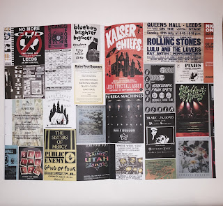
To get ideas for my initial concepts regarding the type in context publication, I took to Behance. The reason I chose Behance over something like google images or pinterest is because I felt that behance is more designer orientated. As my pictures are travel pictures the first thing that came to mind was a publication that had many similarities to a zine as they are often small, handy and cheaply made. Which is the perfect fit for a publication about travellers/travelling for travellers. Another reason for this is whilst I was travelling I stayed in hostels and often in hostels there is an area specifically for leaflets and booklets regarding the surrounding area and you can almost always find small zine like booklets about maybe a local museum or venue.

The first example I looked at was by Megan Raine.
"Hand stitched magazine which was put together to present the photos taken during my Beauty is Everywhere insert."
The reason I chose this was because focus heavily on the images, which will most likely be the case with my own publication, and it demonstrates a bind that allows the book to lay flat. This is an important consideration for me as I want to avoid any of my images or text being lost within the bind.


The second example I looked at was a small publication by Gemma Davis.
"The very architecture of the zines physicality is vital to the formation of meaning. These qualities ensure the nature of the zine as “collectable items, hand-crafted one-offs to be kept and cherished”.1 Each page is A6 size. The size makes it both compact and personal increasing the ability to transport and exchange. The outer cover of the zine is a higher gsm than the inner pages, enveloping the zine so that the reader must first peel back this layer before seeing the more delicate contents. This interaction creates an ally in the reader and invites them into the embodied community that the zine enacts.2 The zine is stitched together, bound by hand. The thread is left loose at the end adding to the ‘mess’ and leaving further trace of authorship."
The reason I chose to look at this one is it included some rational for the design decisions, specifically how the size and paper stock adds to the functionality of the zine as an easily transportable publication, something that would be important for travellers when picking something up at a hostel.
I went out and found some small publications/zines that were available for free to see the quality and compare the stock used to what i plan do do/use. I will also look at binding method to see the most practical.


This is a small catalogue for a hat company that is made using a card like stock for the cover and a stock slightly thicker for the inner pages, that is perfect bound. I like stock combination as it is still fairly flexible yet holds its form so it is unlikely to crease however the bind means the publication does not lay flat or stay open on its own due to the small number of pages. However I like the small size of the publication (a5) as it is very portable, combined with the flexibility of the stock it means that it would fit easily into a bag.

 This publication is for Independent Leeds, it is a4 sized and uses a stock that is slightly thicker than standard paper for both the cover and inner pages, this means that like the catalogue it is flexible however the a4 sizes means its less handy and portable. This publication uses two staples and has the effect of a saddle stitch meaning that when it is open it can lay flat and stays open, which makes viewing and reading the publication very easy.


The first example I looked at was by Megan Raine.
"Hand stitched magazine which was put together to present the photos taken during my Beauty is Everywhere insert."
The reason I chose this was because focus heavily on the images, which will most likely be the case with my own publication, and it demonstrates a bind that allows the book to lay flat. This is an important consideration for me as I want to avoid any of my images or text being lost within the bind.


The second example I looked at was a small publication by Gemma Davis.
"The very architecture of the zines physicality is vital to the formation of meaning. These qualities ensure the nature of the zine as “collectable items, hand-crafted one-offs to be kept and cherished”.1 Each page is A6 size. The size makes it both compact and personal increasing the ability to transport and exchange. The outer cover of the zine is a higher gsm than the inner pages, enveloping the zine so that the reader must first peel back this layer before seeing the more delicate contents. This interaction creates an ally in the reader and invites them into the embodied community that the zine enacts.2 The zine is stitched together, bound by hand. The thread is left loose at the end adding to the ‘mess’ and leaving further trace of authorship."
1 Jessica Bateman, "The Scene That Smells Like Zine Spirit", The Independent, 25 September 2009
2 Alison Pieperman, Girl Zines: Making Media, Doing Feminism (New York, US: NYU Press, 2009)
The reason I chose to look at this one is it included some rational for the design decisions, specifically how the size and paper stock adds to the functionality of the zine as an easily transportable publication, something that would be important for travellers when picking something up at a hostel.
I went out and found some small publications/zines that were available for free to see the quality and compare the stock used to what i plan do do/use. I will also look at binding method to see the most practical.


This is a small catalogue for a hat company that is made using a card like stock for the cover and a stock slightly thicker for the inner pages, that is perfect bound. I like stock combination as it is still fairly flexible yet holds its form so it is unlikely to crease however the bind means the publication does not lay flat or stay open on its own due to the small number of pages. However I like the small size of the publication (a5) as it is very portable, combined with the flexibility of the stock it means that it would fit easily into a bag.

 This publication is for Independent Leeds, it is a4 sized and uses a stock that is slightly thicker than standard paper for both the cover and inner pages, this means that like the catalogue it is flexible however the a4 sizes means its less handy and portable. This publication uses two staples and has the effect of a saddle stitch meaning that when it is open it can lay flat and stays open, which makes viewing and reading the publication very easy.
This publication is called "Beat" and is in the style of a newspaper but is much thicker in terms of the amount of pages and due to that has been stapled for ease of reading. By the fact i had to fold it in order to get it home makes it apparent that this size is far too bog and would compromise the look and legibility of the images and type due to creasing. The think stock also means that the edges of the pages have begun to fold up and get rough and ripped, something that would take away from the overall look and feel of the publication.
Subscribe to:
Comments (Atom)