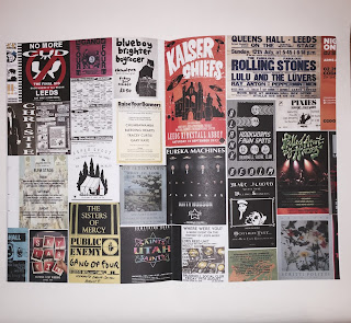
The first example I looked at was by Megan Raine.
"Hand stitched magazine which was put together to present the photos taken during my Beauty is Everywhere insert."
The reason I chose this was because focus heavily on the images, which will most likely be the case with my own publication, and it demonstrates a bind that allows the book to lay flat. This is an important consideration for me as I want to avoid any of my images or text being lost within the bind.
The second example I looked at was a small publication by Gemma Davis.
"The very architecture of the zines physicality is vital to the formation of meaning. These qualities ensure the nature of the zine as “collectable items, hand-crafted one-offs to be kept and cherished”.1 Each page is A6 size. The size makes it both compact and personal increasing the ability to transport and exchange. The outer cover of the zine is a higher gsm than the inner pages, enveloping the zine so that the reader must first peel back this layer before seeing the more delicate contents. This interaction creates an ally in the reader and invites them into the embodied community that the zine enacts.2 The zine is stitched together, bound by hand. The thread is left loose at the end adding to the ‘mess’ and leaving further trace of authorship."
1 Jessica Bateman, "The Scene That Smells Like Zine Spirit", The Independent, 25 September 2009
2 Alison Pieperman, Girl Zines: Making Media, Doing Feminism (New York, US: NYU Press, 2009)
The reason I chose to look at this one is it included some rational for the design decisions, specifically how the size and paper stock adds to the functionality of the zine as an easily transportable publication, something that would be important for travellers when picking something up at a hostel.
I went out and found some small publications/zines that were available for free to see the quality and compare the stock used to what i plan do do/use. I will also look at binding method to see the most practical.


This is a small catalogue for a hat company that is made using a card like stock for the cover and a stock slightly thicker for the inner pages, that is perfect bound. I like stock combination as it is still fairly flexible yet holds its form so it is unlikely to crease however the bind means the publication does not lay flat or stay open on its own due to the small number of pages. However I like the small size of the publication (a5) as it is very portable, combined with the flexibility of the stock it means that it would fit easily into a bag.

 This publication is for Independent Leeds, it is a4 sized and uses a stock that is slightly thicker than standard paper for both the cover and inner pages, this means that like the catalogue it is flexible however the a4 sizes means its less handy and portable. This publication uses two staples and has the effect of a saddle stitch meaning that when it is open it can lay flat and stays open, which makes viewing and reading the publication very easy.
This publication is called "Beat" and is in the style of a newspaper but is much thicker in terms of the amount of pages and due to that has been stapled for ease of reading. By the fact i had to fold it in order to get it home makes it apparent that this size is far too bog and would compromise the look and legibility of the images and type due to creasing. The think stock also means that the edges of the pages have begun to fold up and get rough and ripped, something that would take away from the overall look and feel of the publication.


No comments:
Post a Comment