Monday, January 25, 2016

Leaflet initial research: Public information video.

The video i chose was about smoking heroine.

Messsage: The truth behind smoking heroine.

Key facts: Heroine makes you spotty, unhealthy, tired, consumes your life, highly addictive, risk of blood disease, liver damage and heart failure.

Tone of voice: Fairly informal

Audience: Young people. potential and current drug users.

I think i'll stick to this theme and create a leaflet aimed at students who are potential or current drug users.
having spoke to friends and people that i know, they say that the potential risks associated with drugs won't put them off taking them as they consider themselves recreational drug users. Most deaths from these drugs occur from taking a double dose whilst waiting for the first to kick in so i think a leaflet that talks about how long they take to kick in and how long the effects last for would be good, as well as talk about what effects they can expect to have and what forms the drugs come in. This way if people choose to do drugs or people that already do, will be able to do so in a safer manner.

Final resolution and evaluation


I really like what I have produced and I'm happy with the outcome, as a student myself I feel like it is something I would pick up and read, positive feedback from friends and peers has assured me that I have achieved the aims that's i set out in the beginning. However I still have the worry that it comes across as a promotion for drugs so I would like to, if I had more time, work more on perfecting the layout.

I was also very unhappy with my final print as the colours look dramatically different to how they looked on the colour match screen and there is a transparent box that i couldn't find within my design to delete. I printed off a test version at home and i much prefer that outcome to the professionally printed one. Given more time i would shave liked to spend more time exploring the print outcome in order to get something that i was happy with and did my design justice.

this is my tester version: 


Leaflet Crit and initial ideas

 After my crit and talking through my ideas I'm happy that the approach I'm taking might be fairly successful and will be more accessible and appealing to students

I discussed my ideas for stock and colours and they seems to agree and support those ideas

The only criticism is to make sure it doesn't come across as promoting drug use 

After my crit here is my initial lay out ideas:


Wayfinding Mock ups and thoughts

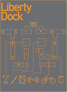
I liked this breif and i was really happy with how it turned out, feedback from my flatmates and other people from liberty dock found the map easy to understand and navigate and the symbols made sense to them. I finished my project with some mock ups but im really dissapointed that i cant make them look realistic as it means that i cant present them and make them look their best. However it is still a significant improvement to the signage before hand.


Wayfinding realisations

I decided to change the icons as the doodle style didn't really suit the new stripped back look so i made some stripped back icons that i think compliment the design a lot more, im really really happy with how this looks as its looks simple and easy to read, therefore being accessible to every nationality and therefore every student which was one of my aims.


wayfinding crisis

After struggling with my initial idea a bit longer i decided i couldn't take it any further, i needed something more simple that didn't look to cluttered and unprofessional so i decided to simplify everything right down and take it back to two colours and simple lines. im a lot happier with where this is now going.


Wayfinding Ideas

Ive had some inital ideas of colour schemes and themes so have done some early experimentation:


I like these and i think it has potential but im struggling to make a cohesive design out of it that i think would work well as signage.

Wayfinding research 2

Having identified the deliverables for my chosen environment I started looking at similar projects to get an idea of how people approach a wayfinding task such as this. i started with a simple Google search and then looked more specifically on
behance.

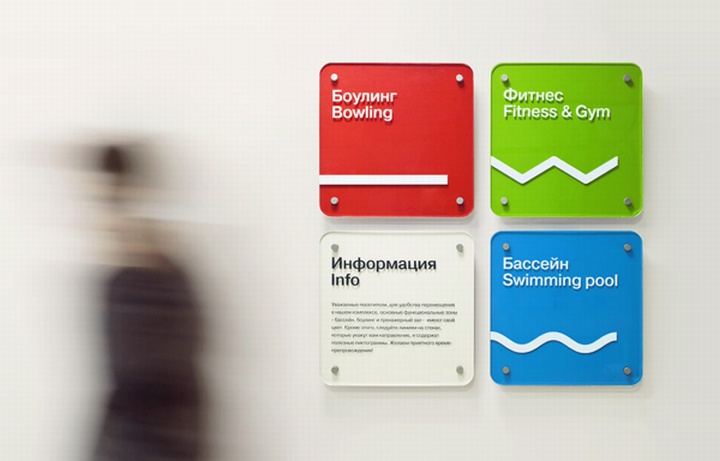
i think for my environment i will need to create something that will stand out against the brick and as there are a lot of international students, symbols that can communicate across the language barrier and be understood by everyone.


Wayfinding research

After frequently getting lost in my own accommodation i decided this would be a good place to design a navigational system for. There is currently no map available to be given out to new students, the lettering of the black follows no logical order, none of the recreational buildings or bike sheds have signs to identify them and the only map available to the complex is high up on a wall immediately on your left as you walk into the complex so it is missed by almost every visitor.

I got a tour of the security guard so i had a bit my familiarity with the complex and took some pictures to document the current state of the buildings.